![]()
![[ NEWS ]](/images/fall97/newsf97.gif)
![]()
By Mary Fan
Arizona Daily Wildcat January 16, 1998
Redesign improves navigation for UA's virtual visitors
![[Picture]](01_3_i.gif)
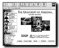
www.arizona.edu The UA's home page was redesigned over Christmas break from the site shown on the left, to the new page on the right. |
Students using the University of Arizona's Web site this semester will have
an easier time navigating, thanks to a redesign during winter break.

Although the site's home page graphics have changed from an aerial view of the UA's campus to an array of campus snapshots set against a cactus border, the modifications go beyond aesthetics.
"The prior UAInfo was a two-level structure - there were just huge lists that were becoming unmanageable and users were saying it was hard to find information," said Brett Bendickson, a support systems analyst with UA's Center for Computing and Information Technology. "We changed it to a three-level structure."
The first level sorts users by identity - student, faculty or alumni. The second is sectioned by content relevant to each user group. The third level links users to a desired department, said UAInfo Advisory Council member Denice Warren.
"The major challenge that UAInfo has is that it is an umbrella site and has to intelligently link to all the major sites in the university," Warren said.
Bendickson said there are currently more than 550 major university-related links on the UAInfo site, at http://www.arizona.edu
"Before, it was actually a hodgepodge - the categories weren't very parallel and were often times redundant," Warren said. "When you actually arrived at the second level page it was very long - you had to scroll and scroll."
The new look initiative began over a year ago, said Rich Amada, chairman of the UAInfo Advisory Council. Focus groups comprised of page designers and users across campus offered their suggestions.
"The overwhelming consensus among these focus groups was that UAInfo should be designed for users," Amada said.
The new design, Bendickson said, was added during winter break to give users time to adjust to the change. The new layout was inexpensive because the advisory council used its members' time and talents, Amada said.
"One of UAInfo's problems is it doesn't have direct funding, so it's a real challenge to undertake something as massive as a site redesign," Warren said.
The new page graphics were designed by Angelica Valenzuela, a UA graphic design alumna.
"I wanted something that was more Southwestern," Valenzuela said. "There's a lot of people all over the world who don't know about the plant life we have here. We're so unique and I just wanted to show that uniqueness."
More changes, Amada said, may be in store.
"This being the Web, nothing is chiseled in stone," he said. "We may change again sometime down the road as we determine what our needs are."


